Too Good To Go
Improving Retention Through Personalization
UX strategy case study exploring why users disengage over time. Focused on identifying friction points and designing opportunities for long-term engagement and habit formation.
Summary
Overview
Introduction
TGTG is a food-saving app offering discounted unsold meals. I worked with a team of 2 product designers to improve user retention by creating a more personalized experience for low-engagement users.
Methods
- User Interviews
- Persona & Journey map
- impact effort matrix
- UI & prototyping
- 5 Second Test
Summary
Why Users Lose Trust and Don’t Return
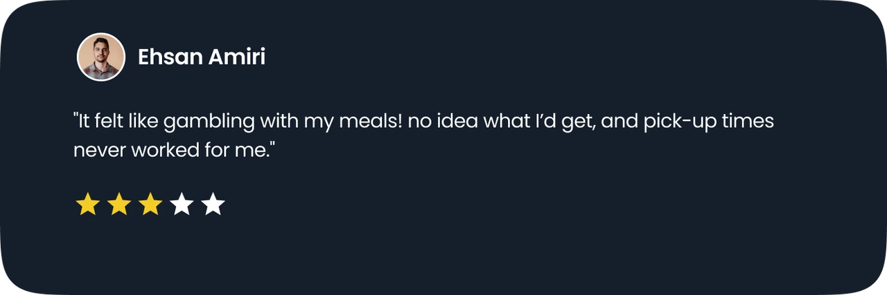
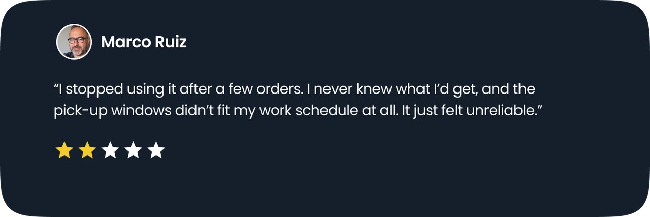
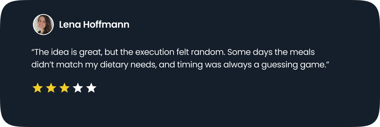
User feedback highlights
Stepping into the user’s shoes
Barriers to Returning: Trust, Timing, and Friction


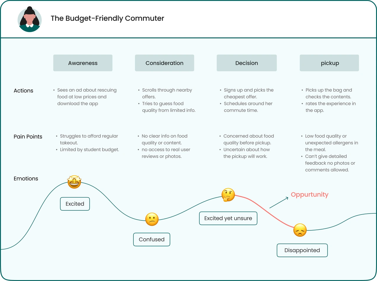
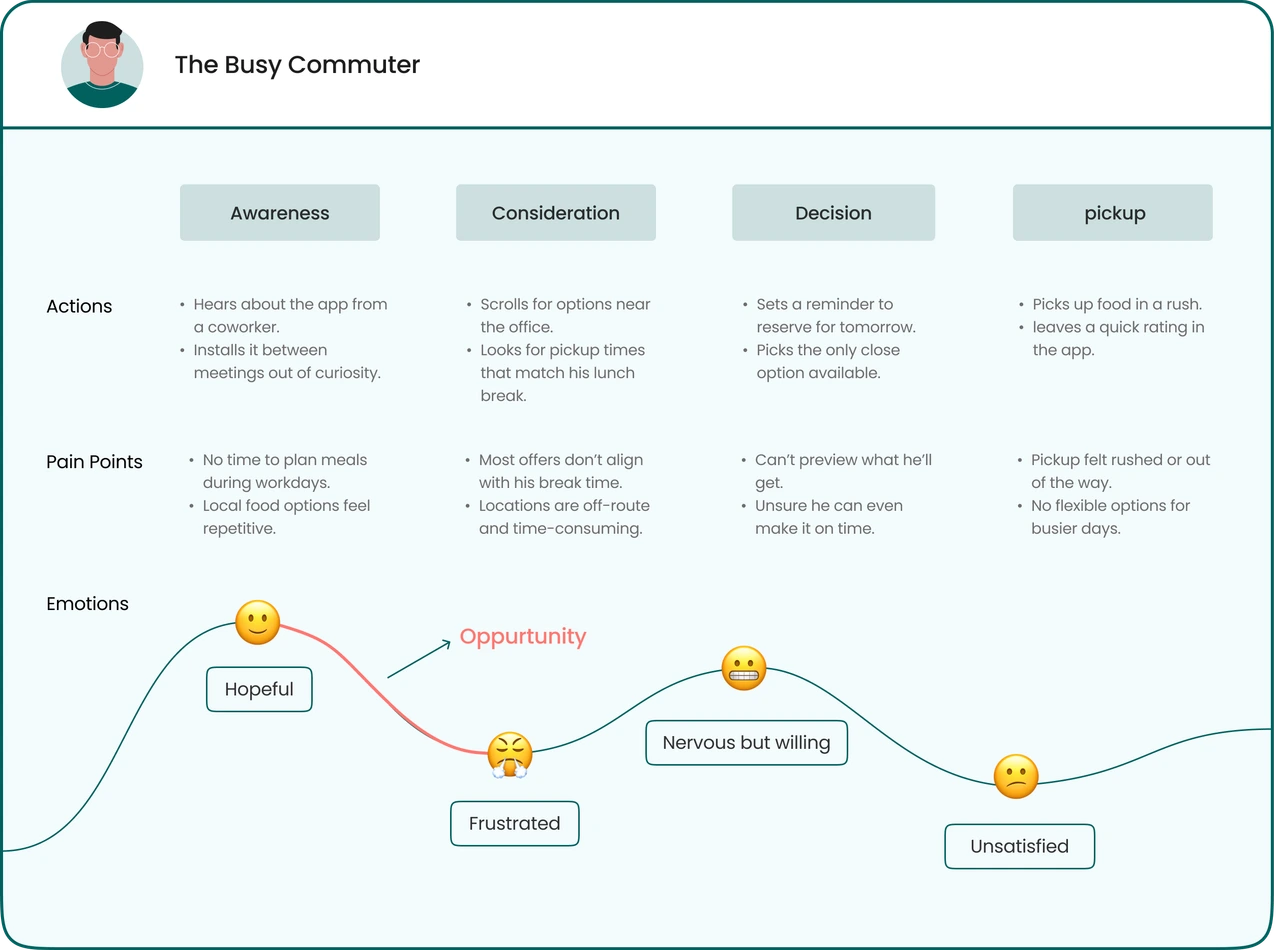
Who Leaves and Why?

The Budget-Friendly Commuter
His Story:
Loves exploring new food and needs budget-friendly options.

The Busy Commuter
His Story:
Looks for quick, affordable meals to fit a busy schedule.

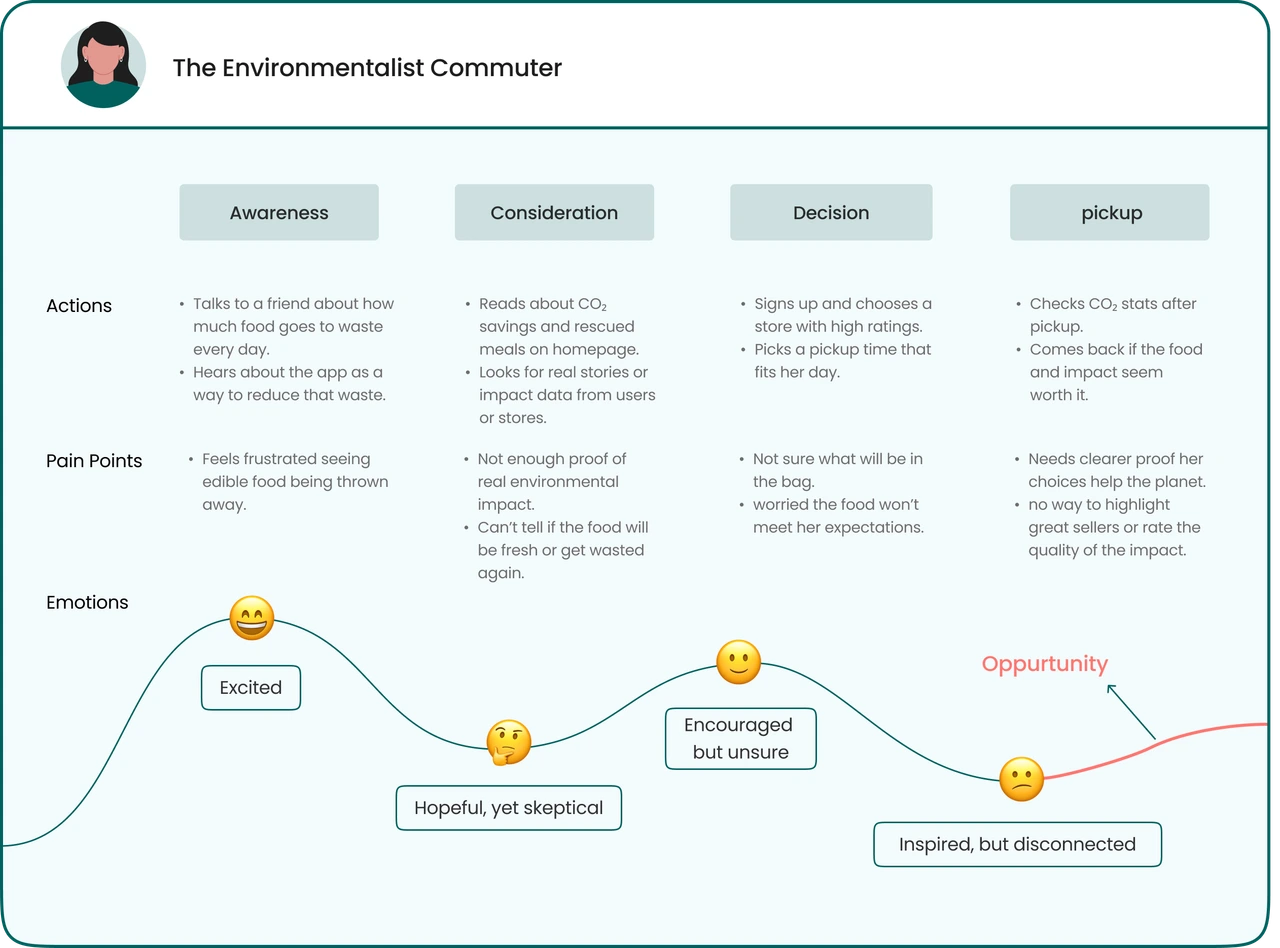
The Environmentalist Commuter
His Story:
Wants to fight food waste and enjoy sustainable, good meals.
Identifying key drop-off moments in the user journey
Reframing insights into opportunities
HMW build more trust around buying a surprise bag?
HMW personalize the experience and make it more inclusive?
HMW offer more convenient pickup options that better fit users' schedules?
Turning Pain Points into Product Ideas
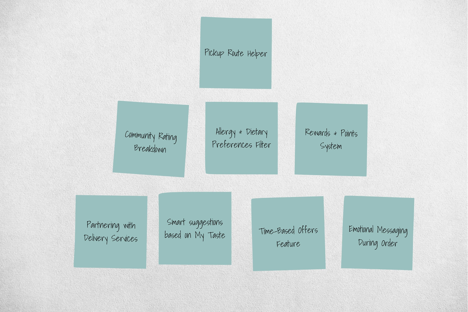
What Should We Build First?
High Impact
Low Effort (Quick Wins)
Sorting Options
Sort offers by price, rating, or time.
Comment & Photo Reviews
Lets users post comments and photos to reflect real experiences.
New Store Alerts
Notify users when new spots open near their location.
High Impact
High Effort (Strategic)
Personalized Diet Setup
Users can set dietary needs and preferences to get smarter, tailored meal suggestions.
Re-engagement Offers
Timely reminders and deals to bring inactive users back.
Freshness Guarantee Policy
If a meal isn't fresh, users can return it.
Low Impact
Low Effort (Fill-ins)
Portion Filter by Group Size
Let users filter offers by number of people they're buying for.
Re-engagement Offers
Timely reminders and deals to bring inactive users back.
Low Impact
High Effort (Maybe Later)
Always-Ready Picks
A curated list of reliable stores with surprise bags available for immediate pickup.
Subscription Access Plans
Affordable daily meal plans tailored to busy schedules and tight budgets.
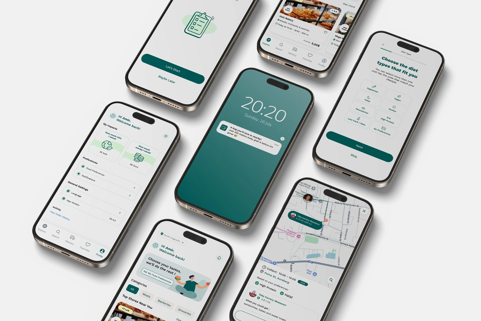
Personalized Onboarding Flow
A seamless, interactive flow designed to capture user preferences early and build trust through transparency. This redesigned onboarding ensures users see relevant content immediately, reducing drop-off rates.
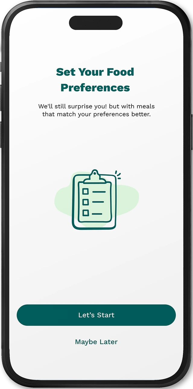
Start Personalization
A clear starting point for preference-based customization.
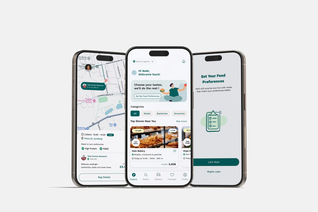
From Old to New: Redefining Core Screens
We redesigned the Home and Profile screens to fix clarity, personalization, and utility gaps found in user feedback.
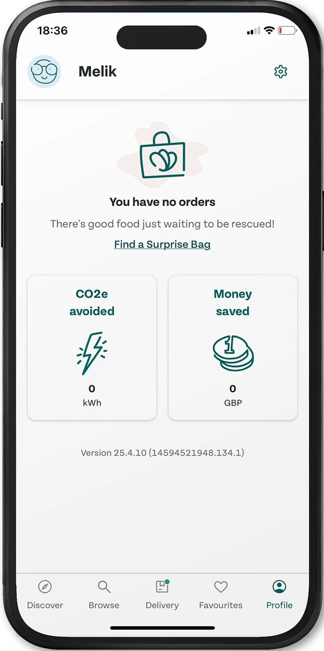
Home Screen Evolution
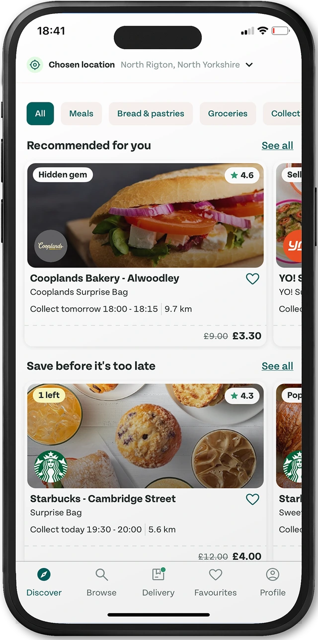
Home - Before
Profile Screen Refinement
Profile - Before
Proactive Personalization with Location-Based Alerts
Delivering timely recommendations based on proximity and preferences to increase engagement and conversion.
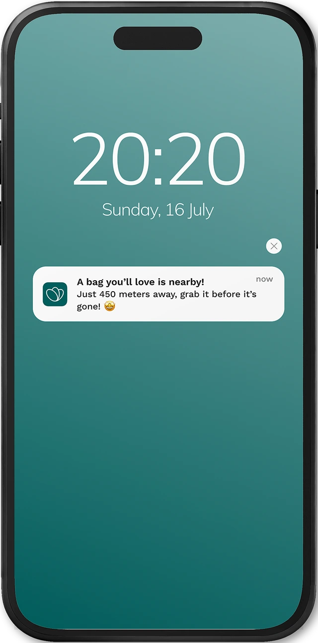
Proximity Alert
Notifies users when a relevant offer is nearby based on location and preferences.
Did we solve the problems?
To understand how clear and intuitive our design was, we asked users a few quick questions right after a 5-second exposure to the screen.
Validating Our Design Decisions
We gathered feedback to understand how users perceived the new design. Their responses show clearer value, improved relevance, and a more satisfying experience overall.
“Now I get meal options that fit my diet and budget. It feels safer and more worth it.”
“I love getting nearby deals without scrolling. It saves me time when I'm on the go.”
“The app finally shows food I actually want ! while still helping me cut waste.”
Keeping a Balance Between Surprise and Clarity
Interested in working together?
Whether you're building a product, improving an existing experience, or looking for thoughtful UX feedback I'd love to collaborate.

Explore more work
Peria — Smart wellbeing app for women
Mooday — Designing Adaptive Daily Planning Based on Energy & Mood
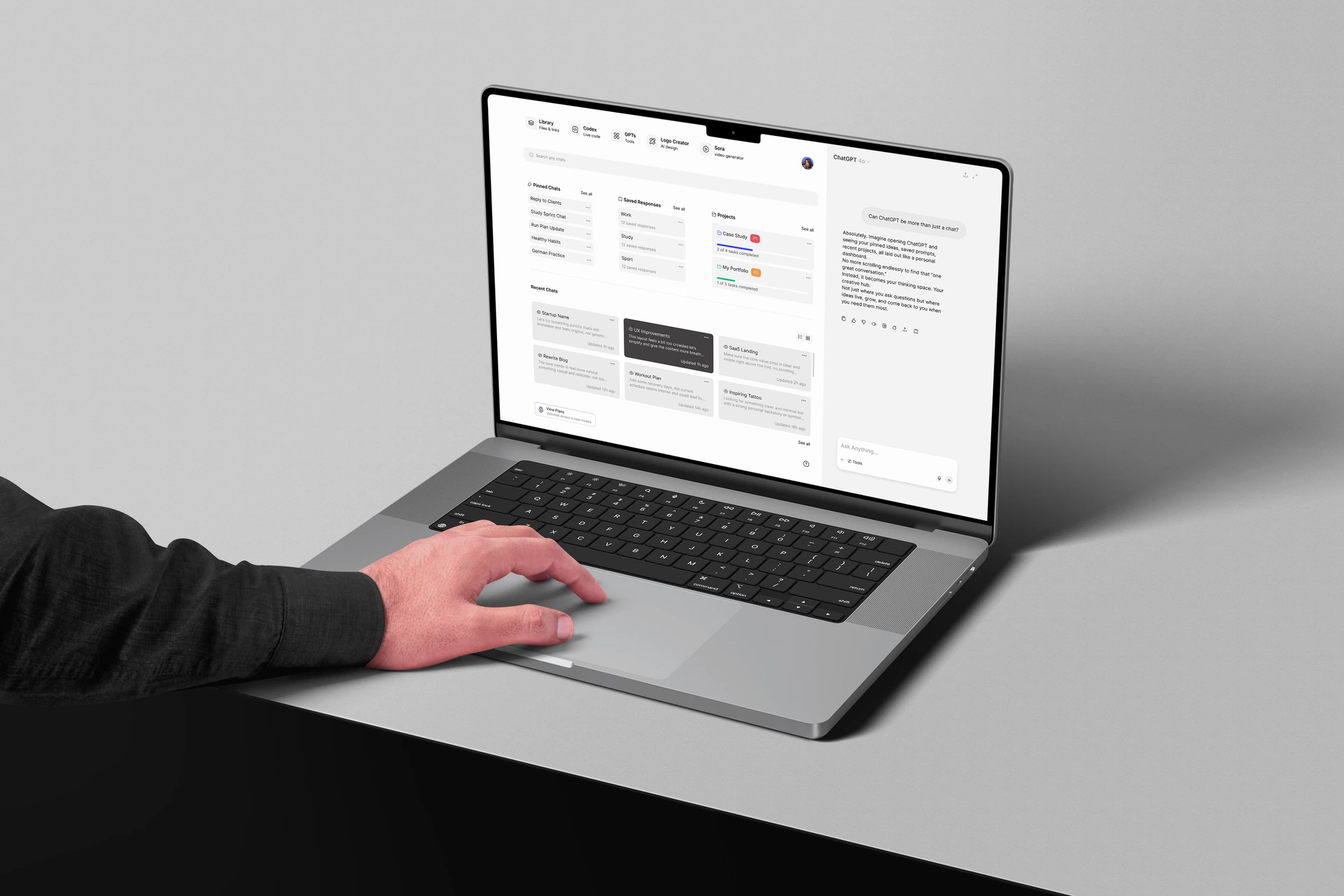
ChatGPT — Designing a Structured AI Workspace Experience
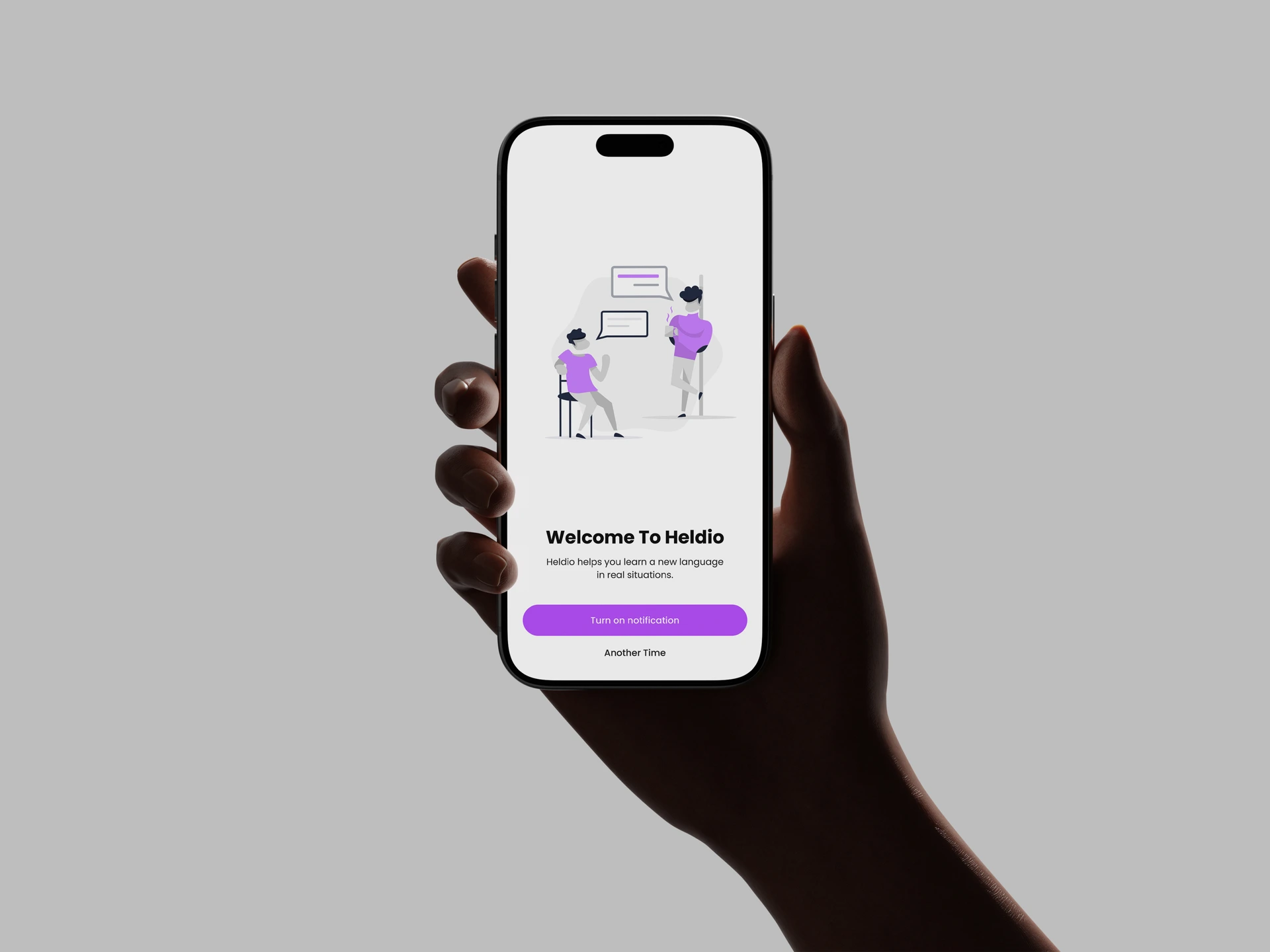
Heldio — Framing the Real-World Language Performance Gap