Peria
Smart wellbeing app for women
A UI-focused design project exploring how a gentle, system-driven interface can support women in understanding their cycle, wellbeing, and daily self-care.
Overview
Introduction
A conceptual mobile product exploring how structured interface design and emotionally aware visuals can support everyday wellbeing and long-term user engagement in a sensitive health context.
Methods
- Interface system design
- Flow structuring and interaction mapping
- Component-based design
- Visual language exploration
- Pattern consistency across large-scale screens
- Rapid prototyping
Summary
Designing calm, clarity, and trust
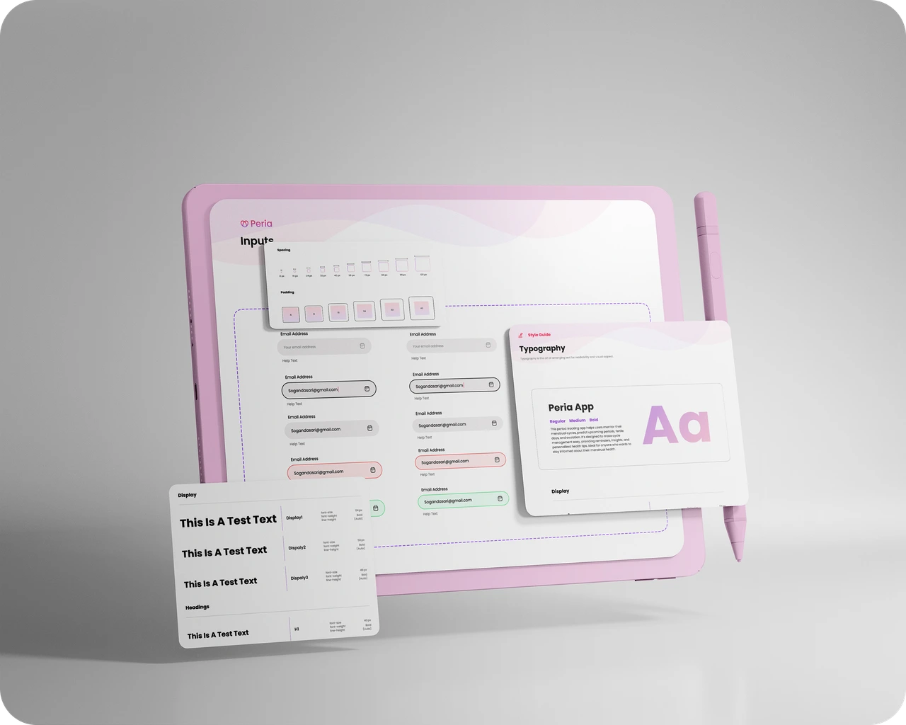
UI & system-level design focus
This project did not include full user research or validation. My role focused on defining the interface language, visual hierarchy, and scalable UI system across key product areas, based on assumed requirements and common patterns in wellbeing products.
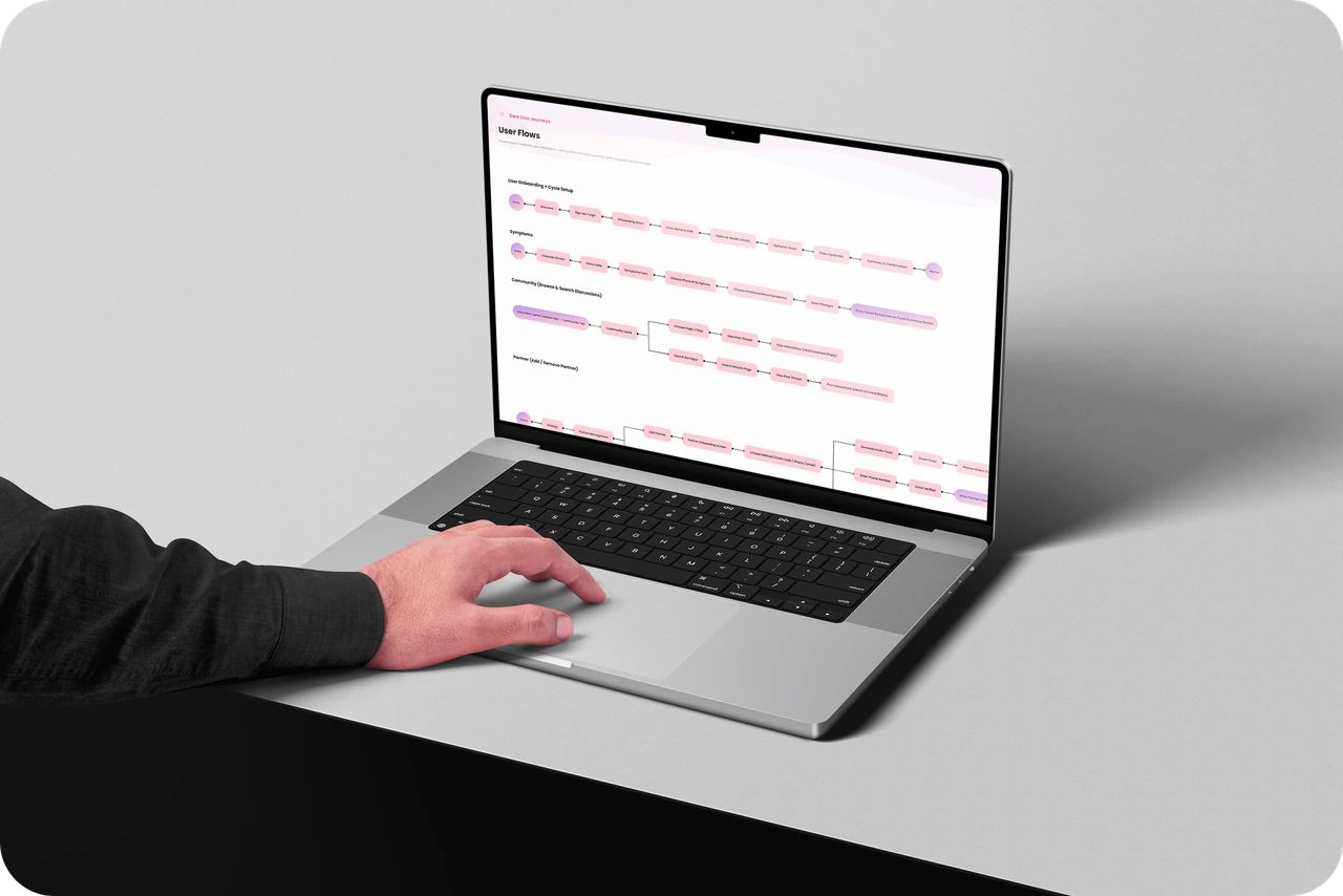
Designing consistency across complex flows 🌊
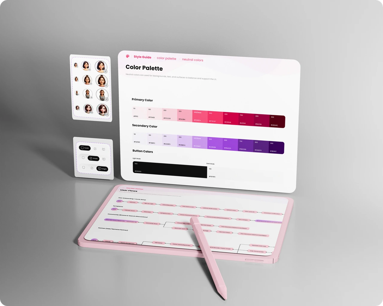
A reusable, system-driven UI foundation 🧩
Visual tone
- Soft and supportive
- Warm, calming color gradients
- Rounded shapes for approachability
- A gentle, low-stress visual feel
Visual consistency
- A clear visual system
- Simple, readable typography scale
- Light, neutral backgrounds
- Subtle character illustrations
Structure before polish
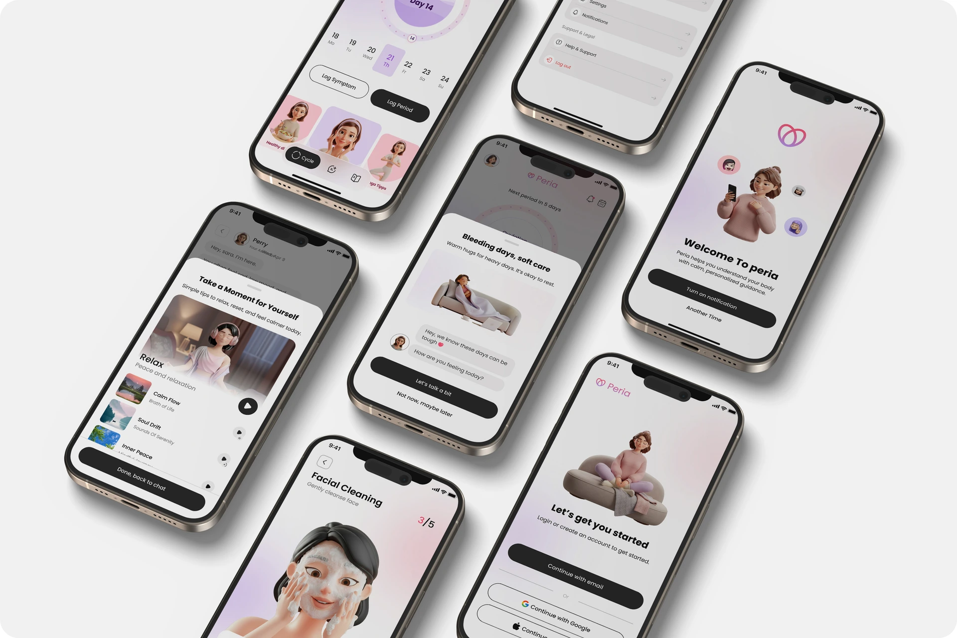
Although the project focused on UI, special attention was given to structuring complex flows—such as onboarding, symptom tracking, partner sharing, and AI interaction—into predictable and repeatable patterns.
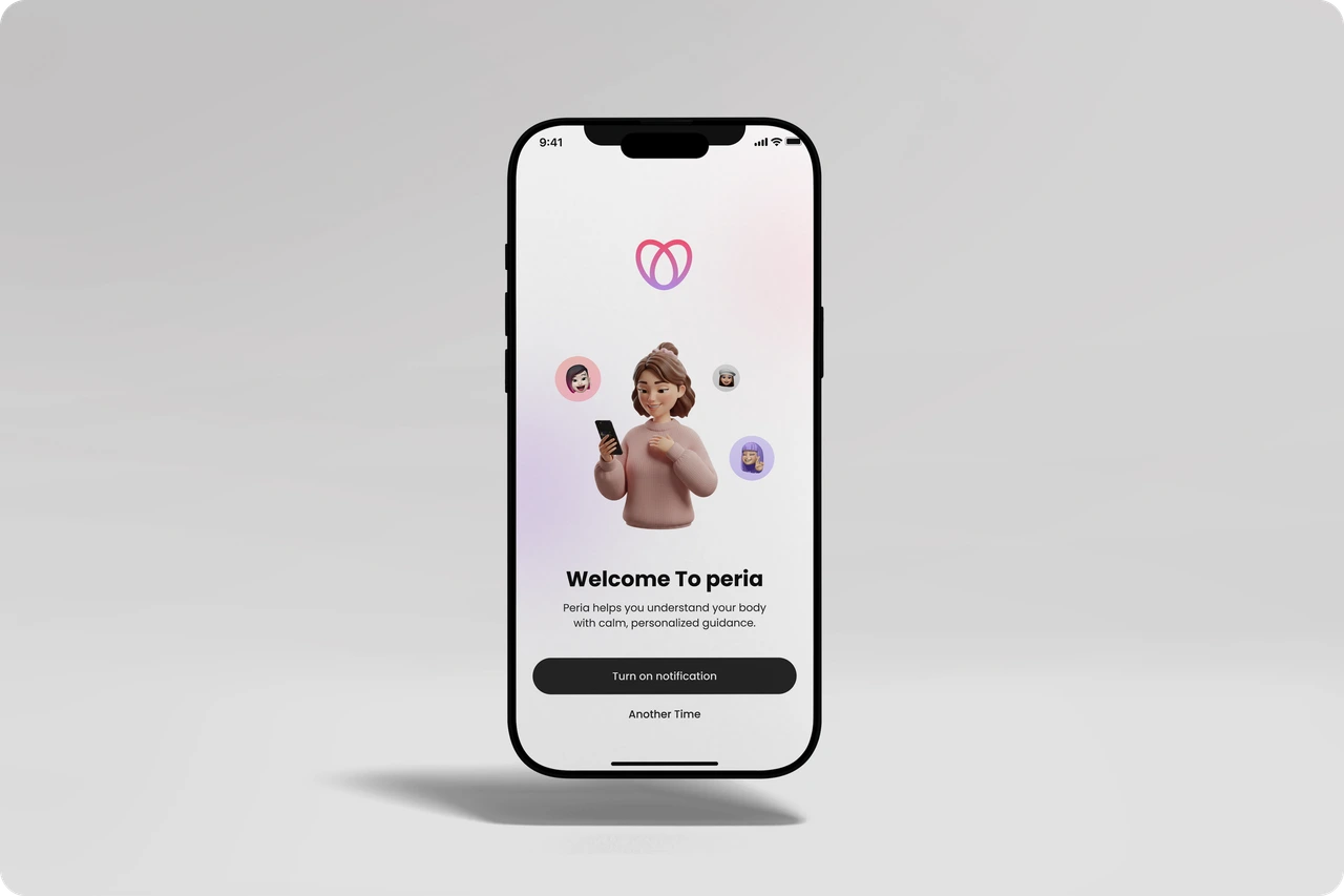
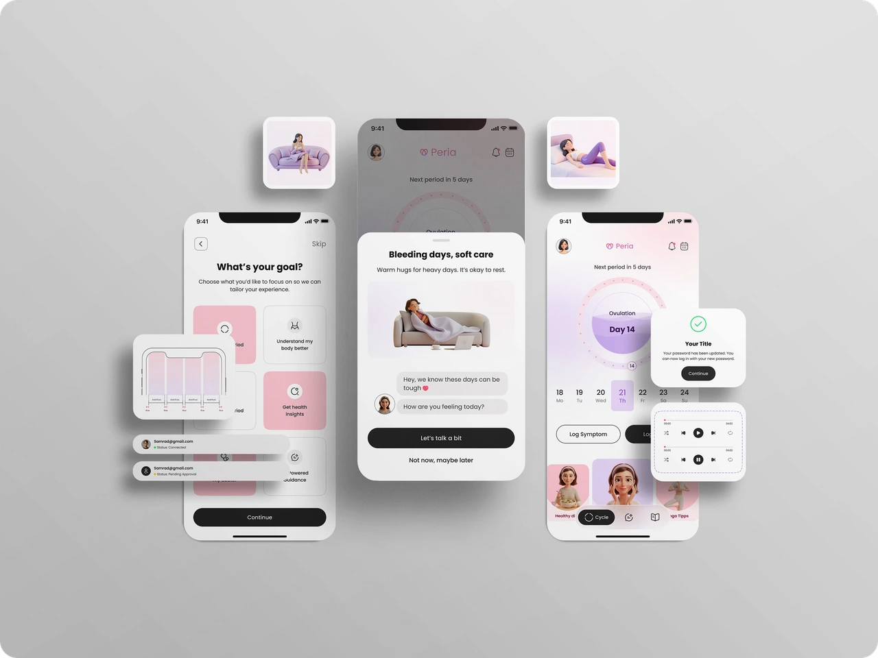
Thoughtful interactions for daily use
Explore the key flows designed to support users through their daily wellbeing journey, from onboarding to daily tracking.
Clear and flexible entry. Designed to support both new and returning users with minimal friction, ensuring consistent patterns across password entry and verification.
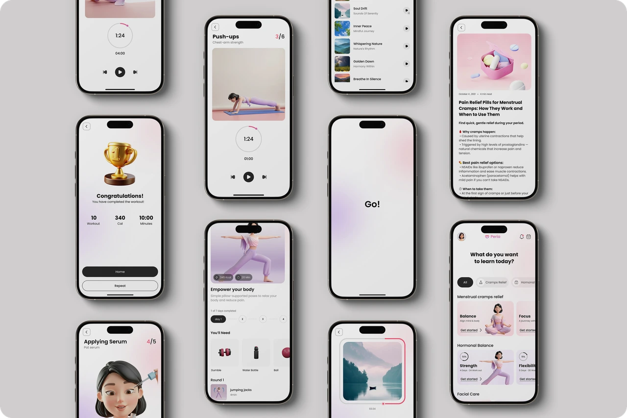
Health content and self-care resources 🧘♀️
Interested in working together?
Whether you're building a product, improving an existing experience, or looking for thoughtful UX feedback I'd love to collaborate.

Explore more work
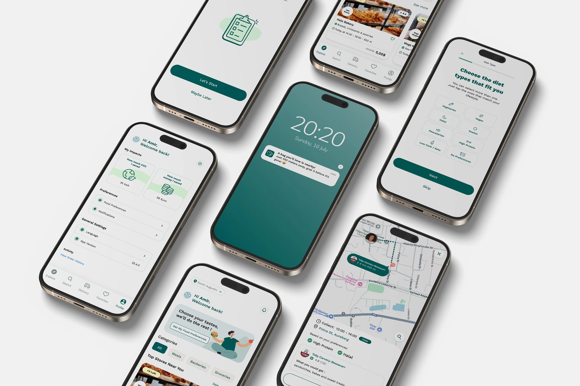
Too Good To Go — Improving Retention Through Personalization
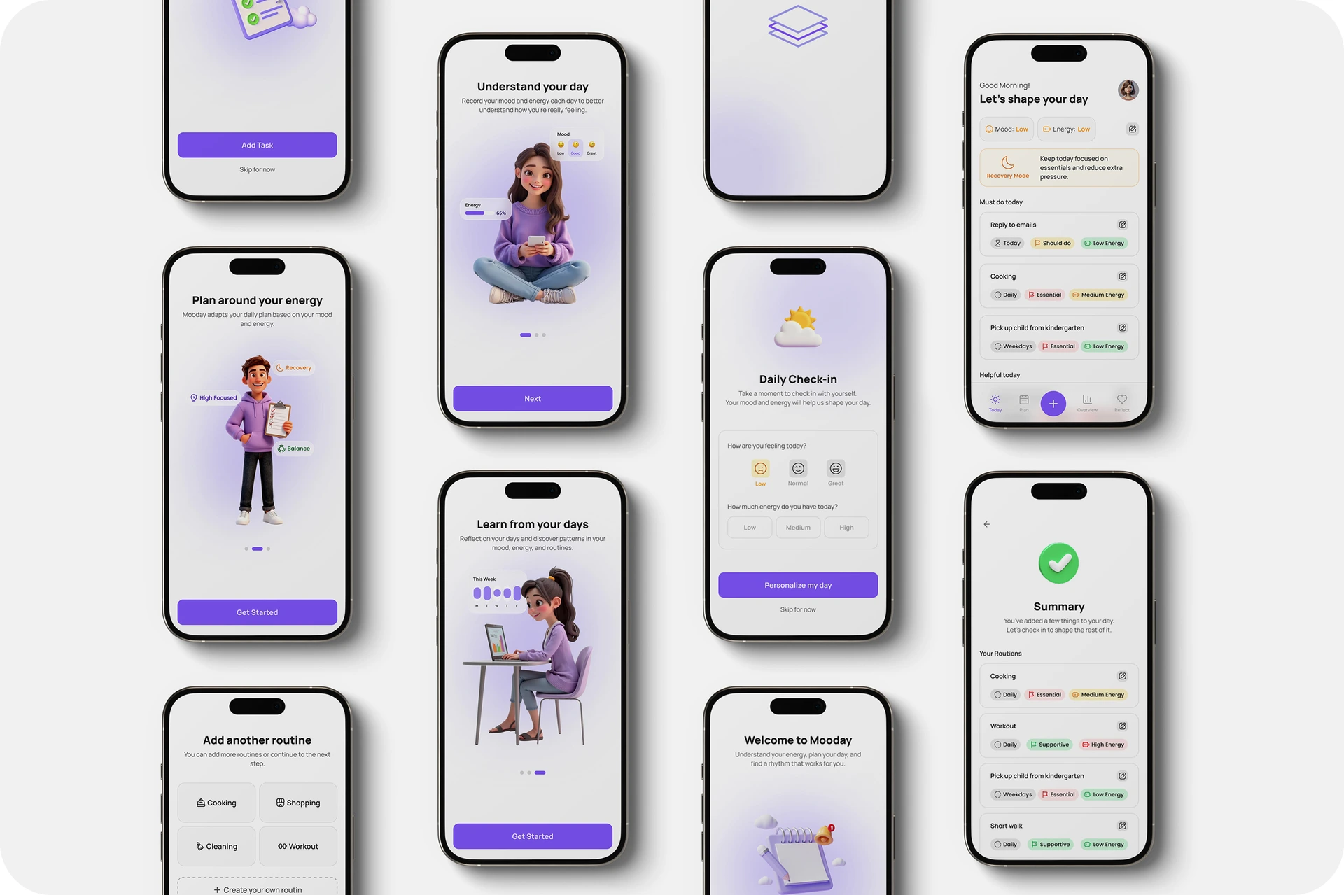
Mooday — Designing Adaptive Daily Planning Based on Energy & Mood
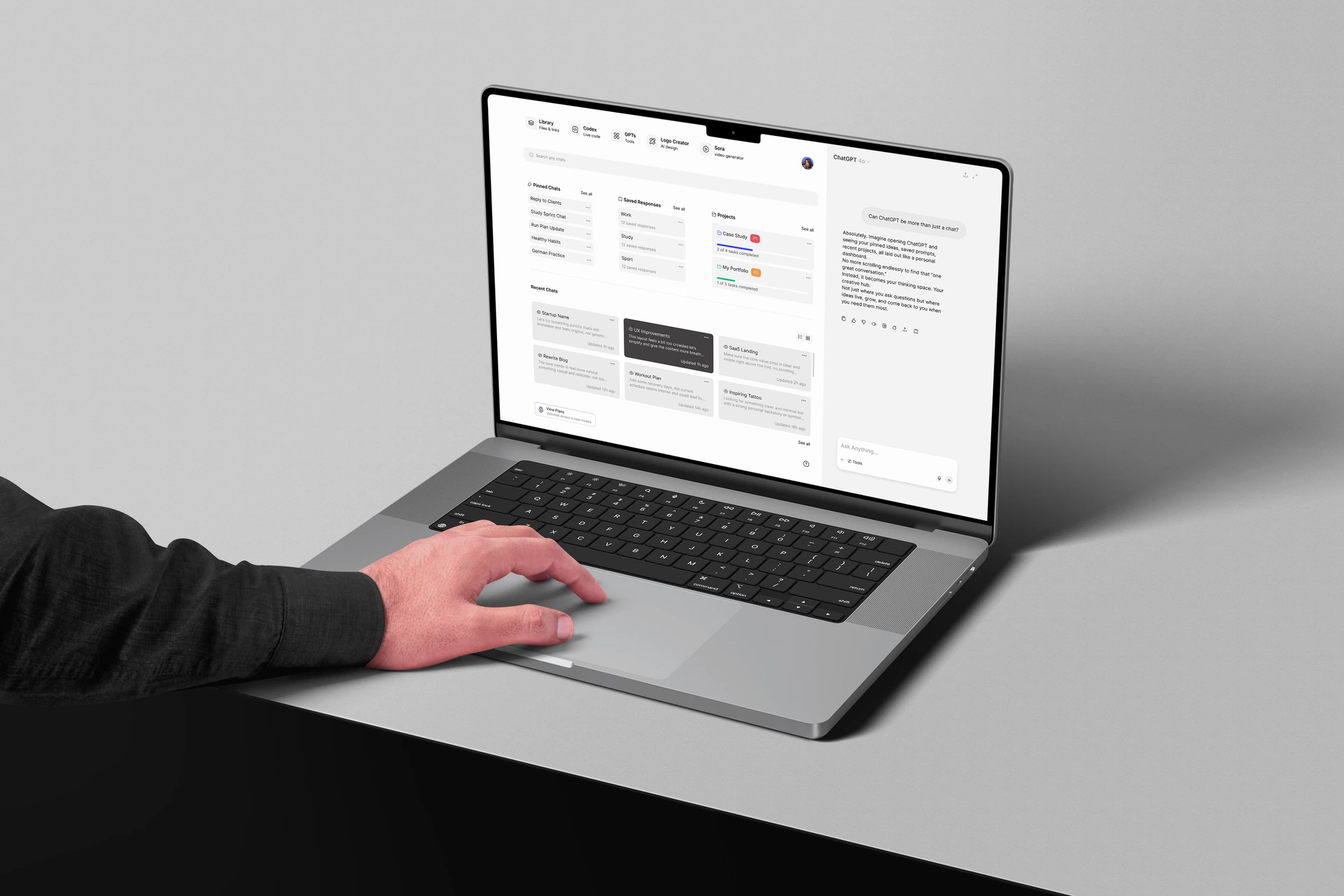
ChatGPT — Designing a Structured AI Workspace Experience
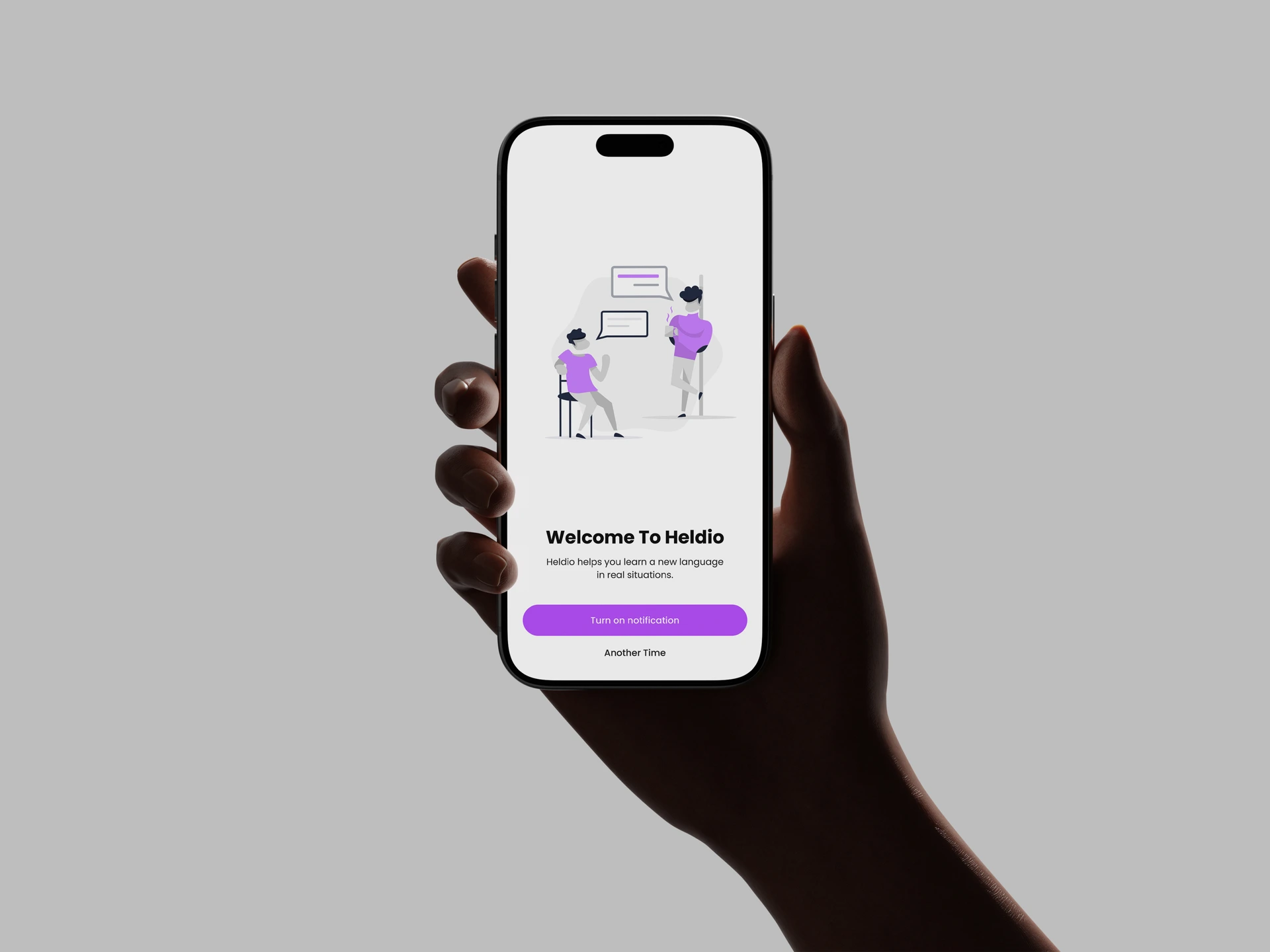
Heldio — Framing the Real-World Language Performance Gap